📊 Reports & Charts Page
“An advanced analytics and charting tool for visualizing inventory, billing, and financial trends.”
🎯 What This Page Is For
The Reports & Charts Page gives you interactive, visual access to all the key data across the system, helping you:
- Analyze performance across Inventory, Sales, Income, Borrow, Dispense, Purchases, and Expenses
- Choose summary types (sum, average, max, min)
- Filter by product, service, time range, or category
- Visualize patterns using bar, line, pie, or area charts
- Save, undo, or print report configurations
This is not just a static report — it’s a customizable analytics dashboard.
🛠️ Key Features of the Reports Page
| Feature | What It Does |
|---|---|
| 📈 ZingChart Integration | Interactive charting tool used for graphing reports |
| 📋 Entity Selection | Choose the type of report (sales, service, borrow, dispense, etc.) |
| 📊 Chart Type Picker | Line, Bar, Area, Pie, and 3D Pie formats supported |
| 📅 Filter by Date | Choose year, month, day, or hour — or set custom date ranges |
| 🧾 Summary Value | Switch between total, average, max, or min calculations |
| 💬 Text Search for Product/Service | Search by product or service name to isolate results |
| ⚙️ Custom Filters | Apply filters defined per entity (e.g., status, store, customer type) |
| 🧮 Draw / Add / Undo Charts | Add charts incrementally, or undo last addition |
| 💾 Save Options | Save your current filter setup for reuse later |
| 🖨️ Print Report | Print your chart and summary layout |
📊 Report Modes (Entities)
When starting a report, you choose an Entity — the category of data you want to analyze. Options include:
| Mode | What It Covers |
|---|---|
| product | Sales or dispense volume by product |
| service | Billing or income from services |
| borrow | Items borrowed from inventory |
| dispense | Items permanently dispensed |
| sale | POS sales |
| income | Non-product income |
| purchase | Cost of purchased goods |
| expense | Other financial outflows (e.g., rent, transport, salaries) |
Each entity uses slightly different filters and chart rules, which are automatically adjusted .
🎨 Chart Types
| Chart Type | Best For |
|---|---|
| Line | Trends over time (e.g., daily or monthly sales) |
| Bar | Comparing volume between products or services |
| Area | Stacked impact over time (e.g., income buildup) |
| Pie | Proportional breakdown (e.g., sales by category) |
| 3D Pie | Aesthetic alternative to basic pie for presentations |
📊 Chart Data Controls
| Control | Function |
|---|---|
| Summary Value | Total, Average, Maximum, Minimum |
| Time Grouping | Hourly, Daily, Weekly, Monthly breakdown |
| Year / Month Filter | Select data from a specific month or year |
| Product/Service Search | Target a single product or service to isolate its data |
| Additional Filters | Apply custom dropdown filters (e.g., by store, status, or customer type) |
| Timeline From/To | Filter by dynamic timelines (e.g., for lifecycle reporting or version tracking) |
🧰 Example Reports
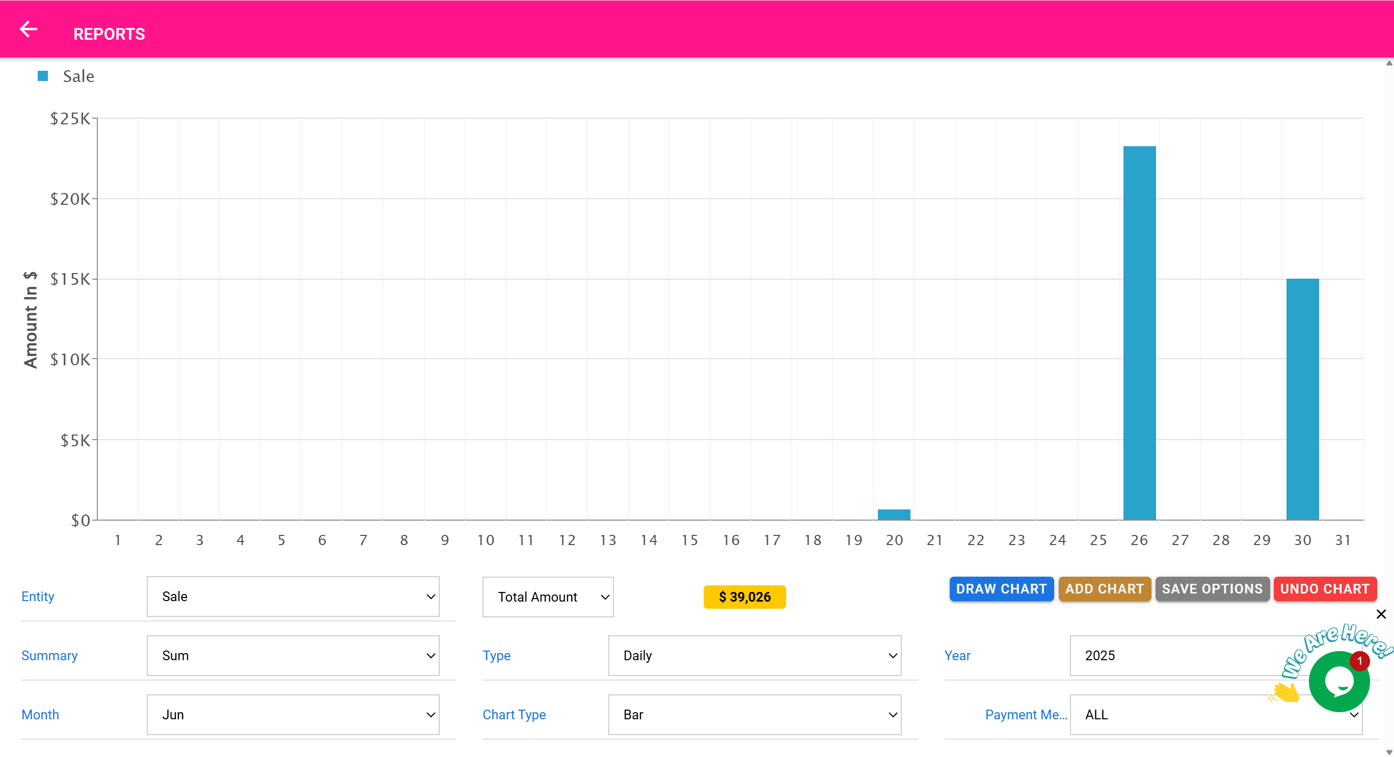
Example 1: Monthly Sales by Product (Bar Chart)
- Select Entity: product
- Chart Type: bar
- Summary: sum
- Grouping: month
- Year: 2025, Month: May
- Draw Chart
✅ Result: A bar graph showing May sales totals per product
Example 2: Weekly Average Service Income (Line Chart)
- Entity: service
- Summary: average
- Grouping: week
- Chart Type: line
- Year: 2025
- Draw Chart
✅ Result: Weekly average income plotted as a trend line
Example 3: Daily Borrow Activity (Area Chart)
- Entity: borrow
- Chart Type: area
- Summary: sum
- Time Type: date
- Month: July, Year: 2025
- Draw Chart
✅ Result: Filled area chart showing borrow activity over July
🔁 Workflow Features
| Button | Action |
|---|---|
| Draw Chart | Replaces the current chart with new data |
| Add Chart | Adds another chart on top of the current one for comparison |
| Undo Chart | Removes the last chart added |
| Save Options | Saves your selected filters and view options for later use |
| Print Report | Opens the print view for exporting a hard copy of your chart and summary |
🖨️ Printing and Exporting
From the chart view, use the Print button to:
- Print full-page charts
- Export for board meetings, audits, or funding proposals
🧠 You can also screenshot combined charts if using multiple datasets.
🧾 Tax Report Mode (Built-In Feature of Reports Page)
“Automatically calculate and visualize tax collected across product and service sales.”
🎯 Purpose of the Tax Report
The Tax Report is a built-in, dedicated reporting mode that gives you a clean, itemized view of all taxes collected over a given time range — across both product sales and service income .
It helps you:
- Review how much tax was collected by product , service , or category
- Track taxable vs non-taxable items
- Print a clean report for submission to tax authorities or finance departments
🧠 Unlike other report modes, this one does not show charts , but instead provides a tabular summary optimized for accounting and export.
📋 What It Shows
| Column | Description |
|---|---|
| Item Name | Product or service name with tax applied |
| Tax Rate | The tax percentage used (e.g., 5%, 12.5%) |
| Tax Collected | The actual tax amount collected during the selected period |
| Total Amount | Value of item/service before tax |
| Net + Tax | Combined amount billed (gross total) |
📅 How to Generate a Tax Report
- Open the Reports & Charts Page
- Scroll to the Tax Report section below the charting area
- Choose:
- Start and End Date
- (Optional) Filter by product, category, or service
- Click Generate
✅ You’ll see a full tabular list of all tax-inclusive items.
📤 Export & Print Options
| Option | Use Case |
|---|---|
| Export CSV | Send to accountants, upload to ERP, or submit to tax agencies |
| Print Report | Create hard copies for filing or audit compliance |
🧠 The report includes both product and service taxes in a combined format — ideal for monthly or quarterly reporting.
🧠 Best Practices
- Regularly review this report to detect items that were not taxed when they should have been
- Make sure your products and services are tagged with the correct tax rate in the inventory or service setup pages
- Use the tax report for both government filing and internal audits
- Export this alongside your income and sales reports to compare taxable and non-taxable revenue
📌
Summary:
The
Tax Report
is a purpose-built, no-chart summary located within the Reports Page that helps you stay tax compliant — effortlessly and transparently.